Vivienne Westwood
This week, Design Legends for Shopify Plus goes looking for what Westwood can teach us about that kind of conviction.
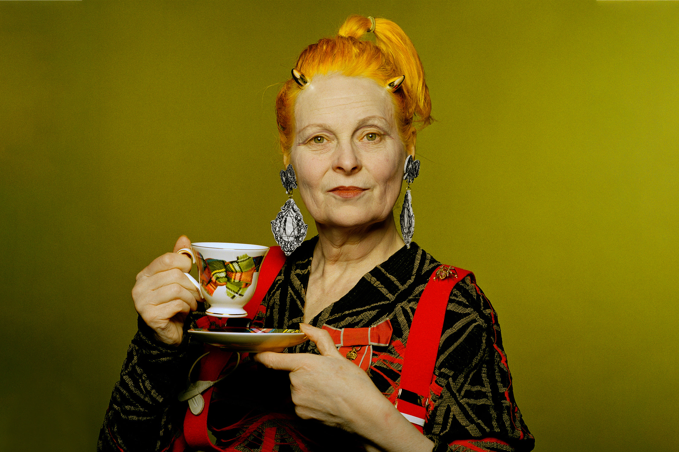
This week, Design Legends for Shopify Plus goes looking for what Westwood can teach us about that kind of conviction.
In the previous article, I reviewed Dieter Rams and what he can teach us about designing for Shopify. His belief was that good design should whisper behind the product. But his way isn't the only way, and it wouldn't suit every brand. And this week have a bit of a contrast. Someone who never whispered in her life.
Vivienne Westwood approached design the way a brick approaches a window. Punk, tartan, corsetry, a slogan safety-pinned to a t-shirt. She treated fashion less as an industry to join than an argument to pick, and she picked the same argument, in the same voice, for fifty years.
That's the part people miss when they say she's chaotic. She wasn't. She had great expression, but she was also one of the most disciplined communicators of her generation. Every collection was a restatement of the same idea, worn slightly differently, until the idea and the woman became indistinguishable.
There's something in that for anyone trying to build a brand with Shopify, where a customer forms an impression somewhere between a thumb-stop and a shrug. It isn't really about being loud. It's about knowing exactly what you stand for and having the nerve to say it the same way, again and again, until it becomes unmistakably yours.
This week, Design Legends for Shopify Stores goes looking for what Westwood can teach us about that kind of conviction. I hope you enjoy it.
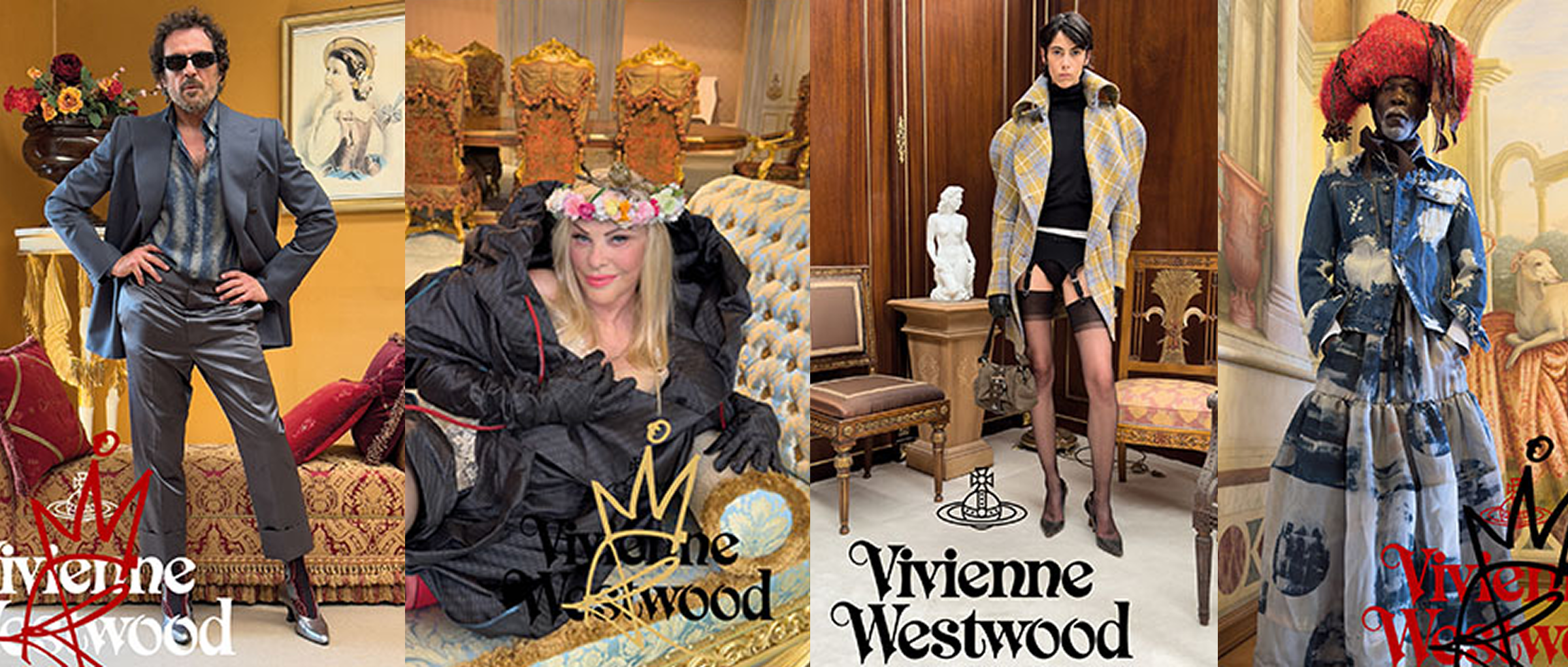
Westwood's idea was simple. Imagery doesn't need to be flawless to be persuasive, it needs to be honest. A campaign shouldn't look like it was engineered in a boardroom. It should look like something actually happening. Casual, a little off, unmistakably real.
The Shopify community talks about this as authentic design and Westwood was doing it for years.
The art direction doesn't have to be the most polished thing on the internet. It has to feel like it belongs to someone. A well-directed page isn't the one with the most production value, it's the one where every visual choice, the photography, the type, the color, is clearly making an argument.
Here are 5 Westwood ideas to help inform art direction for your ecommerce store.
1. Resist the glossy default
Westwood built her visual identity with photographers like Nick Knight and Juergen Teller, both known for a raw, nonchalant energy rather than an over-produced one. Even her most formal campaigns kept an unconventional choice in the mix specifically so the imagery wouldn't settle into a generic luxury tableau. In ecommerce terms: a slightly imperfect, honest shot often builds more trust than another airbrushed hero image.
2. Borrow honestly, then make it yours
Her orb logo is almost an exact copy of the Harris Tweed mark, with Saturn's rings added. She didn't invent an identity from nothing, she found something with real heritage and gave it an edge. A store's visual identity doesn't need to be original for its own sake, it needs a real reference point it can push against.
3. Let type and color carry meaning, not decoration
Her royal and goth fonts turned up on both the logo and the slogans printed on garments. Red, black, white, and gold weren't chosen for variety, gold signaled luxury, the rest stayed neutral, and bold color was reserved for specific campaigns only. Every typographic and color choice should be able to answer "why this, here". Not just "does it look nice."
4. Direct toward the message, not the moment
Her most consistent line: "the most important weapon we have is public opinion." Campaigns were built to make people think, not just look. A product page's art direction can do the same: the imagery isn't there to be admired in isolation, it's there to make the case for why this thing matters.
5. Keep the visual codes consistent across decades
The same fonts, the same restrained palette, the same handful of collaborators returned again and again over 40+ years. Art direction earns recognition through repetition, not reinvention every season. A Shopify store's photography style, type, and color logic should feel like the same hand, whether it's this month's drop or last year's.
Vivienne Westwood spent five decades turning a King's Road punk boutique into one of fashion's most influential houses, working with the same handful of photographers and a tightly restrained visual language the entire way. Her guiding belief, stated plainly: the most important weapon we have is public opinion.